
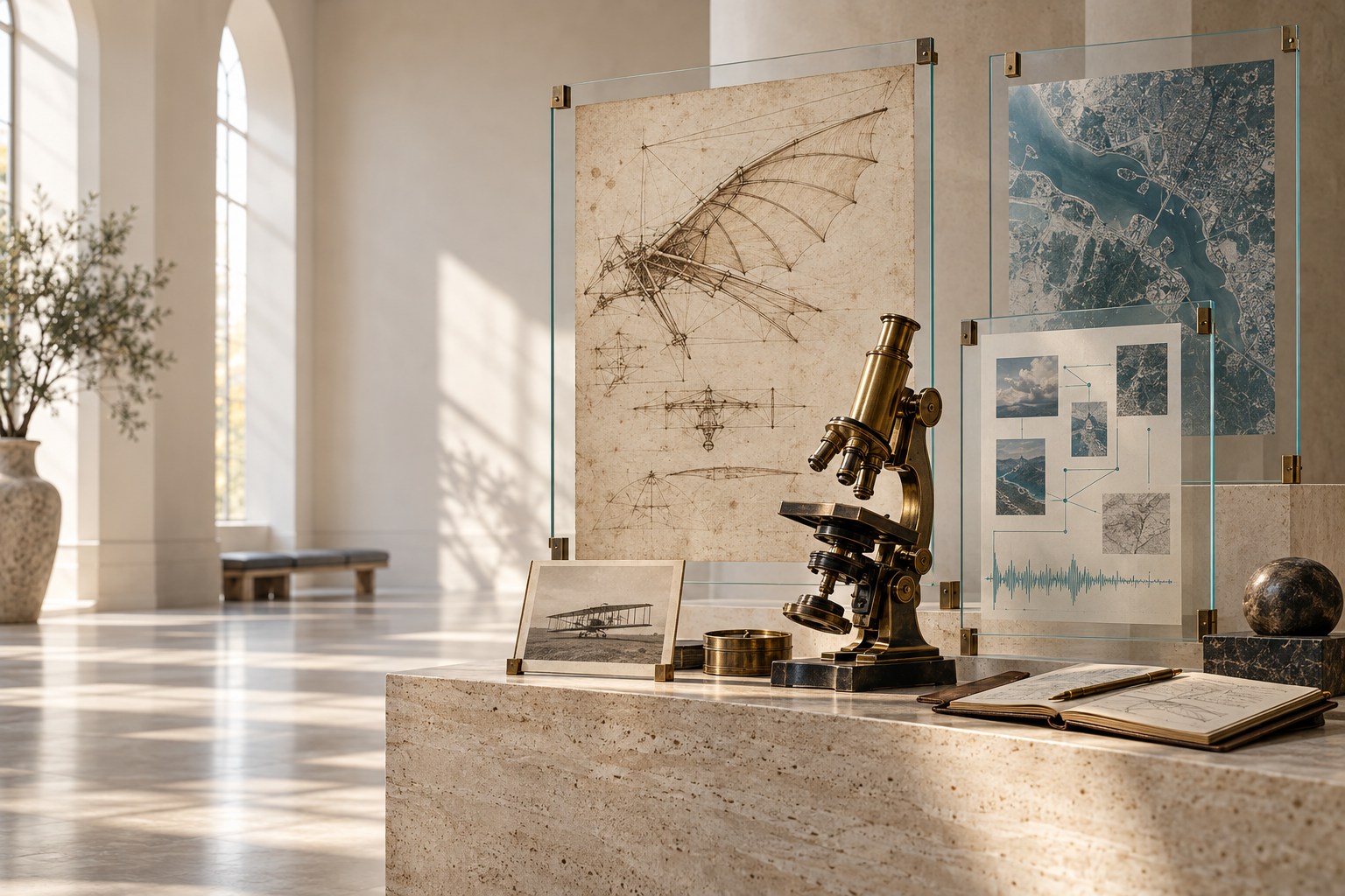
OPTION A · CURRENT WEBSITE
Discovery Gallery
Warm ivory, forest teal and editorial spacing. The current website puts explanation and source review first.
Explore Option A ↗Compare the two directions. Think about the collection you work with, and what would make you request a demonstration.
Warm ivory, forest teal and editorial spacing. The current website puts explanation and source review first.
Explore Option A ↗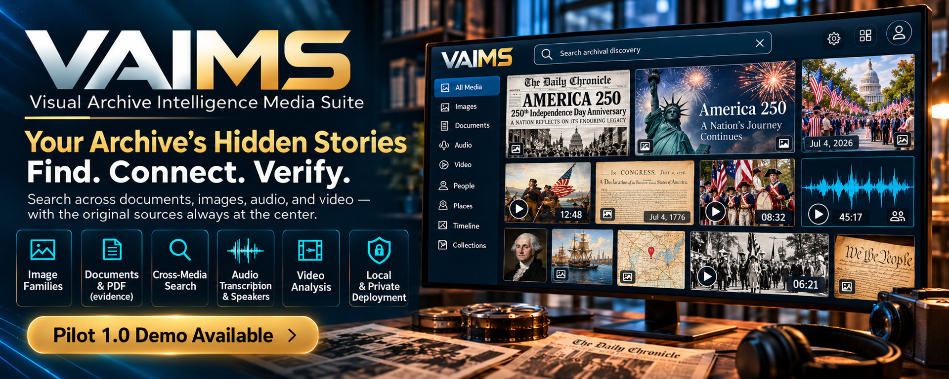
Deep navy, warm gold and larger promotional artwork. A more cinematic introduction to the same project.
Explore Option B ↗Which option makes the purpose clearer? Which feels more credible? Which makes you more interested in a demonstration?
Share your ratings ↗Feedback uses our contact form and requires your name, email and consent. Ratings go privately to the VAIMS team; no public score or vote count is shown.
See all three campaign banners ↗